

Customer Billing & Self-Service
Reducing customer support friction through mobile-first bill education.
Contributed to a 20% reduction in call centre volume over 2 years through a UX-led bill explainer redesign.
R O L E
Senior UI/UX Designer
A G E N C Y
RMA Consulting
P R O D U C T
Bill Explainer + My VM
S C O P E
MVP → Full Redesign
Executive Overview
Virgin Media’s existing bill explainer was complex, non-responsive, and difficult to navigate — particularly on mobile. Customers struggled to understand their bills. This drove unnecessary call centre traffic and increased operational costs.
I partnered with product and delivery teams to redesign the experience, initially through a mobile MVP, then through a full UX-led rebuild. This was a user clarity initiative with measurable business impact.

The Business Context
The organisation had two primary goals: to increase managed service visibility and digital adoption, and to reduce call centre volumes over time.
The existing explainer was not responsive and had poor mobile usability.
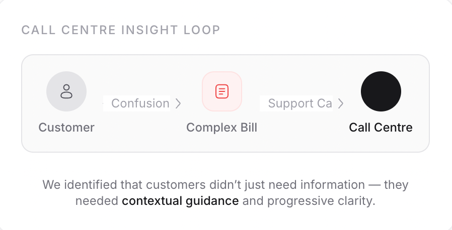
Provided insufficient contextual guidance for users.
Required heavy cognitive effort to navigate.
Discovery & Research
We began by analysing the existing product, comparable market solutions, and customer friction points. Critically, we spoke directly with call centre handlers to ground our redesign in real behavioural data.
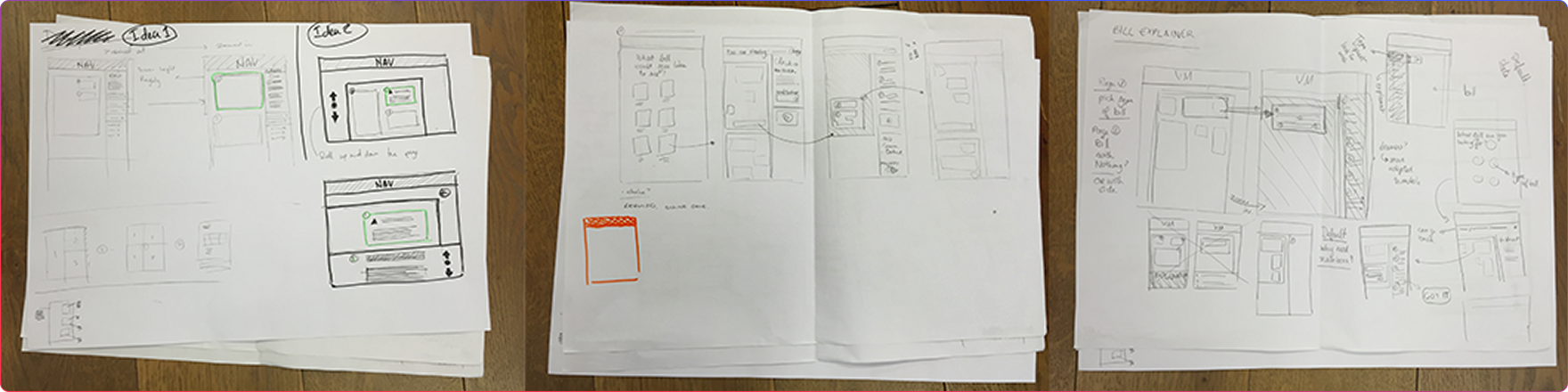
Phase 1
MVP Mobile Version
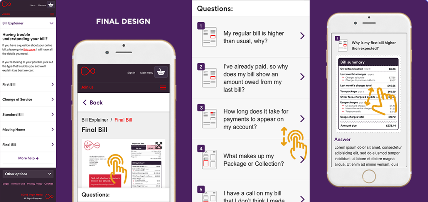
Our objective was to create a mobile version of the existing product to address rising mobile usage, demonstrate the potential for improved UX, and gain stakeholder buy-in for a deeper redesign. The MVP focused on improving layout hierarchy, clarifying navigation, and adding contextual imagery.
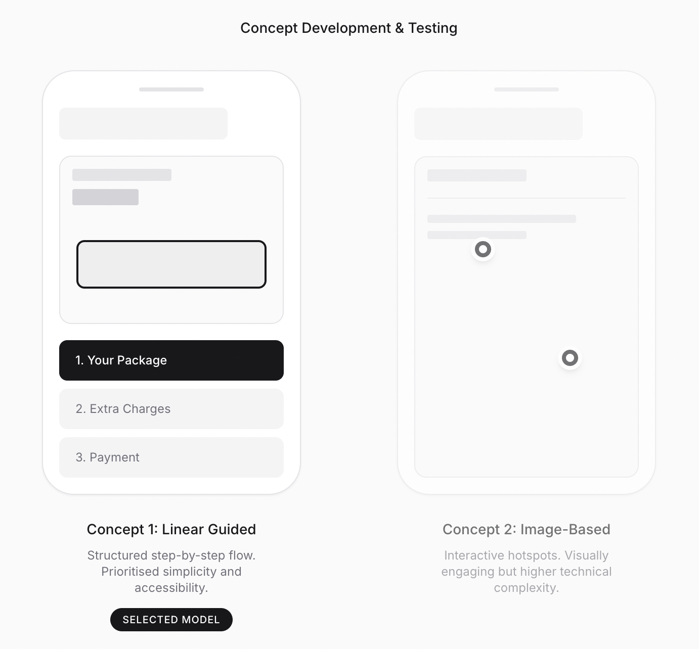
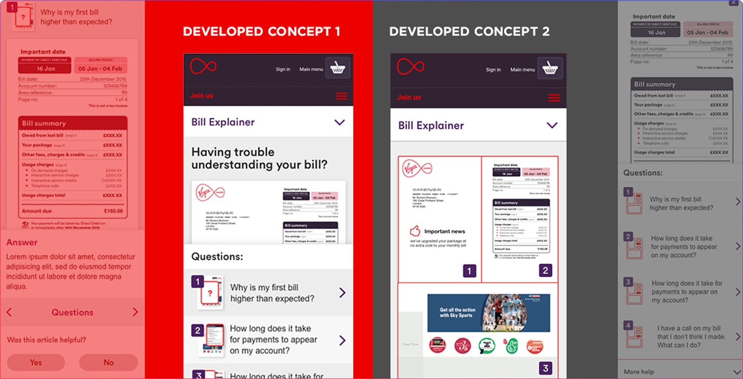
Final Design Decision
We selected the refined linear model because it was easier to implement at scale, reduced technical complexity, and aligned better with accessibility best practices. The experience became clearer, more contextual, mobile-first, and less cognitively demanding.
Phase 2
Full Redesign
After measurable usability uplift in MVP testing and stakeholder approval, we were commissioned to redesign the bill explainer experience from scratch. The solution matured from a “mobile fix” to a strategic self-service platform.
Enhanced affordances
Refined visual hierarchy
Improved FAQ linking
Fully responsive behaviour
Business & Organisational Impact
20%
Call Centre Reduction
In combination with the My VM initiative, improved bill clarity reduced inbound billing-related support demand over 2 years.
500%
Increase in Hiring Rate
Improved trust and delivery quality strengthened client confidence, thereby expanding the scope of the managed services engagement.
Full Implementation
Enabled broader accessibility and improved mobile usability during a period of rising mobile traffic.
Organisational Shifts
Strengthened collaboration between UX, product, and ops.
Increased confidence in UX-led decision-making.
Demonstrated value of iterative MVP approaches.
UX moved from a cosmetic update to an operational lever.

Why This Matters
Customer confusion is an operational cost.
By improving clarity within billing communication, support demand decreased, customer confidence improved, and digital self-service adoption strengthened. This project demonstrated how UX can directly influence operational efficiency and commercial growth.
"Designing not just for aesthetics — but for reduced friction, measurable outcomes, and sustainable service improvement."
What This Demonstrates
Customer-Centred
Research grounded in true behavioural insight.
Measurable Impact
Clarity-driven UX leading to business outcomes
Iterative Strategy
MVP approach aligned to stakeholder confidence.
Balanced Execution
Balancing user needs with engineering feasibility.