


Scaling Digital Self-Service Across Billing & Account Management.
Reducing customer support friction through mobile-first bill education.
Contributed to a 20% reduction in call centre volume over 2 years through a UX-led bill explainer redesign.
R O L E
Senior UI/UX Designer
A G E N C Y
RMA Consulting
P R O D U C T
Customer Account Dashboard
A G E N C Y
RMA Consulting
Executive Overview
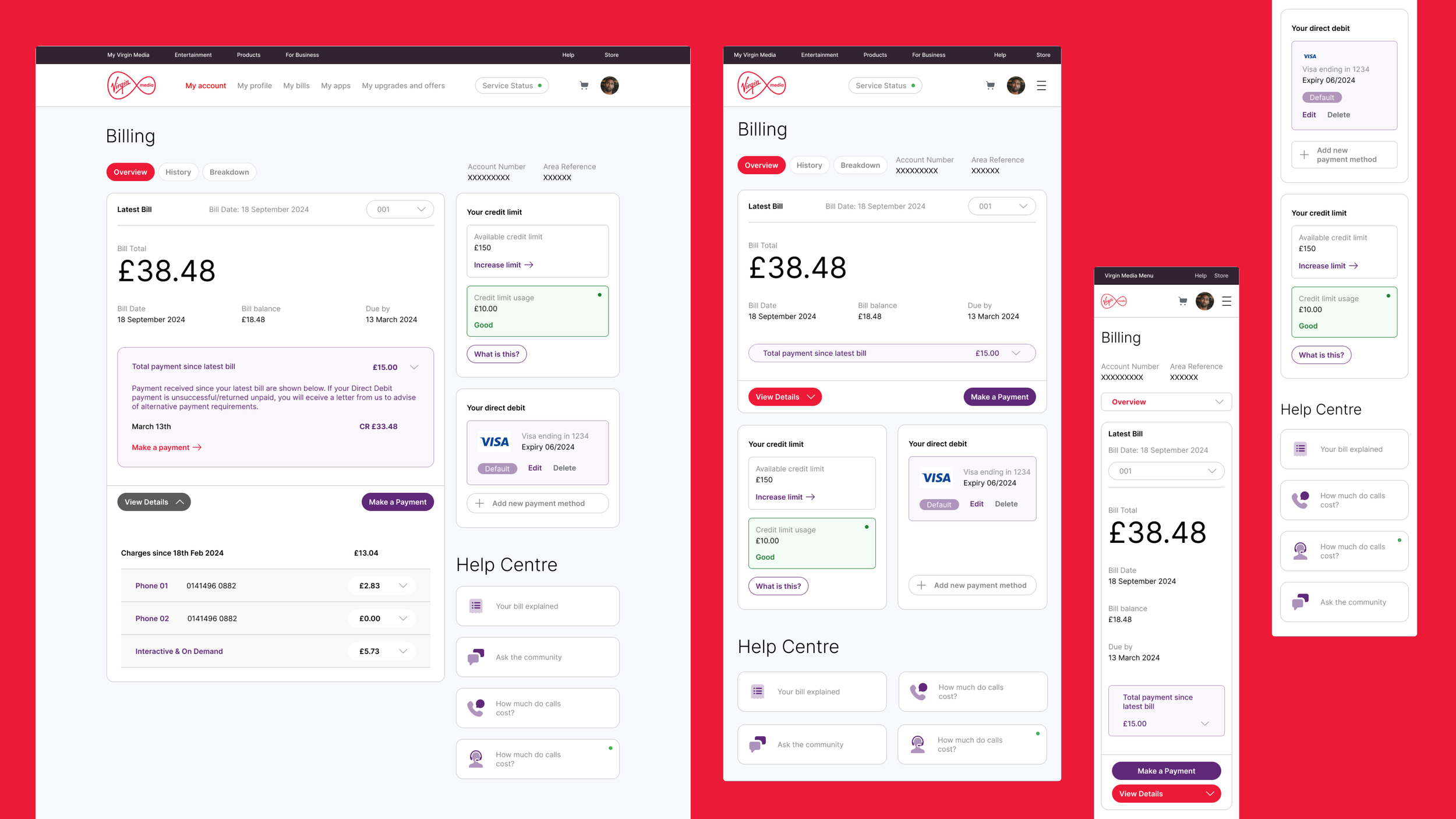
My Virgin Media (My VM) is the customer-facing dashboard used for managing billing, services, and account information.
The platform needed to mature into a clearer, more responsive, and scalable self-service experience — particularly as mobile usage increased and customer expectations evolved.
I worked across UX and UI to strengthen the billing experience, improve dashboard clarity, and reduce friction within account management workflows. This was a digital self-service optimisation initiative aimed at reducing operational burden and increasing user confidence.

The Business Context
Virgin Media’s strategic objective was to:
Increase digital self-service adoption
Reduce dependency on call centres
Improve customer trust in billing and account management
Modernise the platform visually and functionally
Customer confusion around billing and account changes was driving unnecessary support demand. Improving clarity had direct operational value.
The Core Problem
The My VM platform faced several issues:
Legacy visual patterns
Poor mobile responsiveness
Limited contextual guidance around billing
High cognitive load in account management tasks
Weak integration between the dashboard and the bill explainer flows
As more customers moved online, the experience needed to scale in both clarity and usability.

My Role & Scope of Influence
I worked as part of a UI/UX pair within a cross-functional team, including Product owners, Product managers, Developers, and call centre stakeholders.
My responsibilities included:
User research & mapping
Rapid prototyping & A/B testing
Visual design & UI component
Dev specifications & QA
Accessibility considerations
Aligning with billing initiatives
This was both executional and strategic work.
Discovery & Research
We began with:
Product analysis of the existing dashboard
Competitive benchmarking
Conversations with call centre handlers to identify recurring customer issues
Patterns revealed:
Billing confusion was a major driver of support requests
Users struggled to understand line items and service breakdowns
Mobile interaction patterns were inconsistent
Visual hierarchy did not support scanning behaviour
The redesign focused on reducing friction through clarity and contextual reinforcement.


Design Strategy
A systematic approach to solving the core user problems.
1. Improve Information Hierarchy
Prioritise high-frequency actions
Surface billing and service status clearly
Reduce visual clutter
Improve scannability
Clarity reduces hesitation.
3. Mobile-First Responsiveness
Work consistently across breakpoints
Improve touch interaction
Enhance readability on smaller screens
Maintain accessibility compliance
Mobile clarity became foundational.
2. Strengthen Billing Integration
Align dashboard views
Connect to bill explainer flows
Surface relevant FAQ and support links
Seamless movement between explanation and action
This reduced cognitive friction.
4. Iterative Testing & Validation
Validated navigation clarity
Ensured content comprehension
Refined interaction simplicity
Continuous stakeholder feedback loops
Ensured alignment with operational objectives.
Impact Outcomes
Quantitative Impact
20% reduction in call centre volume
Over 2 years. In combination with improvements to the billing experience, clearer self-service reduced inbound support demand.
500% increase in hiring rate
Improved managed service trust. Demonstrated value strengthened client confidence and expanded engagement scope.
Fully responsive implementation
Improved accessibility and mobile usability during a period of increasing digital adoption.
Why This Matters
Customer confusion drives operational cost.
Clearer dashboards reduce hesitation.
Reduced hesitation increases self-service confidence.
Increased confidence reduces support dependency.
This initiative demonstrated how UX clarity directly influences operational efficiency and commercial sustainability.
Organisational Impact
Strengthened collaboration between UX, product, and support teams
Improved trust in the digital self-service strategy
Reduced reliance on reactive support models
Matured visual and interaction design consistency
Strengthened digital brand experience
"The dashboard evolved from a utility tool to a strategic self-service platform."
What This Demonstrates
Platform-level UX thinking
Cross-functional collaboration
Operational metrics alignment
Mobile-first design maturity
Long-term ecosystem impact
This reflects my ability to operate across customer-facing systems and improve both user experience and business performance.